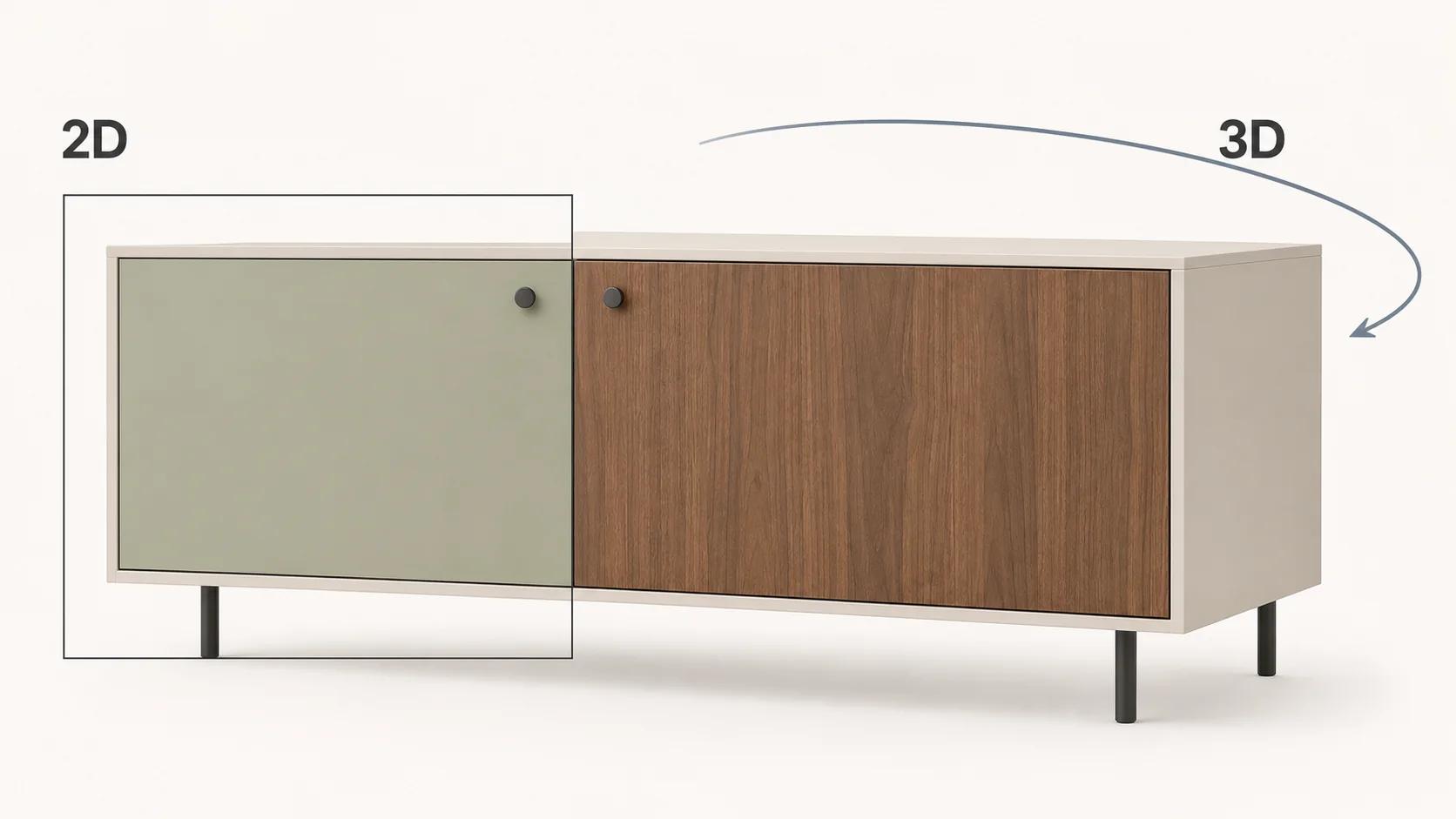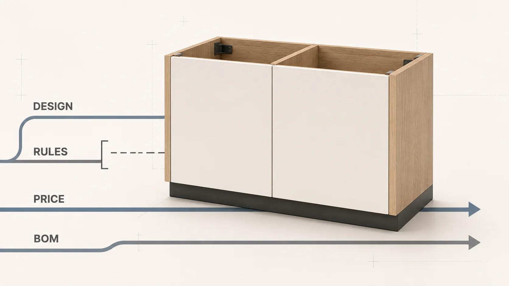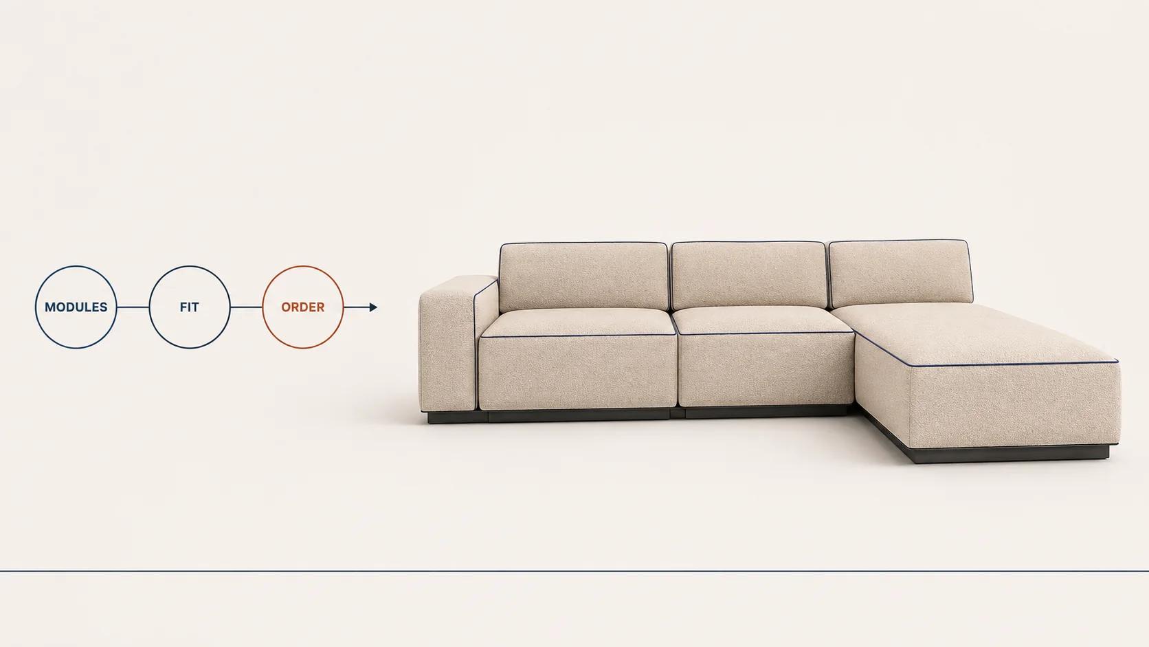
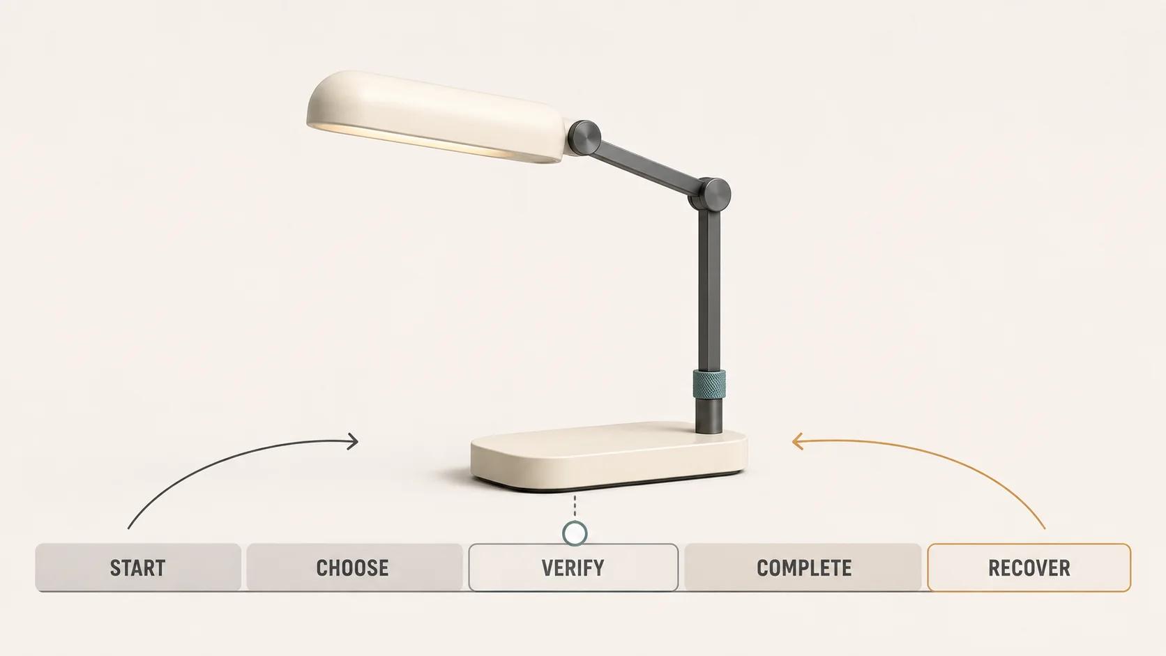
An interactive product configurator feels easy when the buyer can understand the available choices, see what each choice changes, recover from a wrong turn and carry a valid result forward. The 3D view helps, but it cannot compensate for unclear rules, a hidden price change or a configuration that disappears after refresh.
Use the 15 patterns in this guide as an audit, not a feature checklist. A made-to-order industrial system and a consumer product do not need identical controls. Both need a legible state, predictable consequences and evidence that the important paths work. Nielsen Norman Group's usability heuristics cover the same fundamentals: visible system status, user control, error prevention, recognition rather than recall and useful recovery messages.[2] Those heuristics are starting points, not proof that a particular configurator is usable or commercially effective.
Use this page to audit the configurator UX. The broader 3D product configurator guide explains rules, visuals and outputs. If the open question is whether the experience is a configurator, customizer or viewer, use the configurator, customizer and viewer comparison first.
Audit the journey, not the best-looking screen
A useful review follows a configuration from first load to a saved, shared or submitted result. It includes ordinary choices, incompatible combinations, slow asset changes, a narrow viewport, keyboard operation, refresh and an expired or outdated saved state. A polished default screenshot covers none of those transitions.
Fix one representative product and a small set of tasks before reviewing. For example: choose a mounting type, change the finish, select an incompatible accessory, compare two valid combinations, reset one choice, rotate the model, continue on a phone and reopen a saved link. Record the rule-set version, product data, asset revision, browser, device, viewport and network profile. Without that test profile, "the configurator works" is too vague to reproduce.
Annotated UX pattern library: this is an original Double Edged editorial framework. Each row names the buyer-facing pattern, the question an auditor should ask and the evidence that closes the row. A row can pass only when that evidence exists for the stated test profile; the library reports no observed outcome.
| # | Pattern | Audit question | Evidence to retain |
|---|---|---|---|
| 1 | Purposeful starting state | Is the first state valid, representative and honestly labeled? | Initial state record, default rationale and product-rule version |
| 2 | Visible scope | Can the buyer tell what is configurable and what stays fixed? | First-view capture and comprehension-test notes |
| 3 | Progressive disclosure | Are core choices visible while secondary detail appears when needed? | Decision map and recordings of novice and expert tasks |
| 4 | Recognisable options | Can someone identify a choice without remembering an internal code? | Option labels, swatches, preview states and content review |
| 5 | Unambiguous selection | Is the chosen value clear visually and programmatically? | Focus, checked-state and screen-reader inspection |
| 6 | Explained constraints | Are impossible combinations prevented with a useful reason? | Rule trace for available, unavailable and prerequisite states |
| 7 | Controlled cascades | Does a changed prerequisite preserve valid work and disclose every reset? | Before-and-after state log with reset messages |
| 8 | Predictable camera | Does the view remain under the buyer's control when the product changes? | Camera-state script across option and asset changes |
| 9 | Undo, reset and compare | Can the buyer reverse a local action without starting over? | Undo/reset tests and comparison-state record |
| 10 | Persistent price | Is the current total or pricing status visible beside its cause? | Price trace for every priced option and exception |
| 11 | Configuration-level availability | Does availability belong to the selected combination rather than the product family? | Inventory or lead-time responses for named configurations |
| 12 | Review before commitment | Can the buyer inspect and edit the full result before the next step? | Summary-state capture and edit-path tests |
| 13 | Mobile and keyboard parity | Can core tasks be completed without precise dragging or a desktop pointer? | Physical-device, keyboard, focus and target-size results |
| 14 | Visible processing state | Does every interaction produce timely, accessible and current feedback? | Interaction timings, status announcements and stale-response tests |
| 15 | Save, share and recover | Can the result survive refresh, another device and a rule-version change? | Saved-state schema, link tests, expiry behavior and migration result |
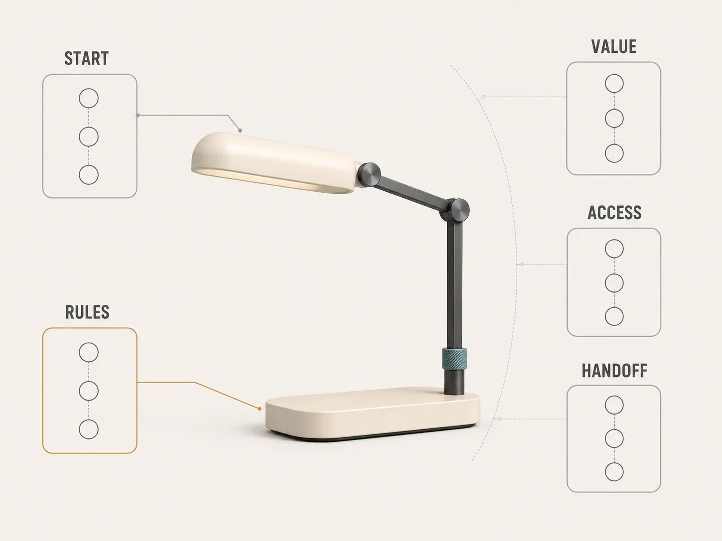
This library identifies UX and evidence work that affects scope: rules, state history, responsive controls, pricing messages, persistence and test coverage. It does not estimate a build or invent a price. The estimator turns those drivers into an explainable complexity profile.
Patterns 1-4: make the first decisions obvious
1. Start with a purposeful, valid state
A default should help the buyer understand the product, not quietly steer them to the highest-margin combination. Use a representative valid configuration when product and commercial owners can explain why it is appropriate. Label any preselected options and include them in the total. If no honest default exists, begin unselected and make the first required decision unmistakable.
Defaults must pass through the same rules as user-made selections. Test them against locale, channel, inventory and customer eligibility. Nielsen Norman Group treats useful defaults and constraints as error-prevention tools, but the business still has to verify that its chosen default is valid for this product and audience.[2]
2. State what can change and what stays fixed
Show the configuration boundary near the start. Name the choices the buyer controls, the parts that remain fixed and the output they will receive. "Choose finish, mounting type and cable length" is more useful than "Create yours." Use customer language in the interface and keep internal option IDs in the data layer.
This small scope statement prevents a common misread: a rotatable 3D model can look as though every visible part is configurable. If a handle, lens or base is fixed, say so. If a choice changes only the visual preview and not the purchasable specification, identify that difference before the buyer relies on it.
3. Reveal detail at the moment it matters
Keep frequent, decision-driving choices in the first layer. Put rare technical settings, explanatory detail and secondary outputs behind clearly labeled controls. Progressive disclosure is the practice of showing important options first and revealing specialised choices on request.[1]
Do not split choices merely to shorten the screen. Nielsen Norman Group warns that staged disclosure becomes problematic when users must move back and forth between interdependent steps.[1] Finish and trim may need to stay together if one changes the availability or appearance of the other. The task map, not an arbitrary step count, decides the grouping.
4. Let buyers recognise options
Give each choice a plain name and a visible state. Pair a material swatch with its finish name; pair a dimensional option with a unit and a simple size cue; pair a technical accessory with one sentence about its effect. A tiny colour chip or internal part number forces recall and makes similar options hard to distinguish.
The preview should confirm the selected value, but it should not be the only confirmation. Lighting and display conditions can make two materials look alike. WCAG 2.2 says colour must not be the only visual means used to convey information, indicate an action or distinguish an element.[3] Keep the selected label, state marker and product summary available in text.
Patterns 5-8: make rules and visual behaviour trustworthy
5. Make the current selection unmistakable
Selected, focused, hovered and unavailable are different states. Give each a distinct treatment. A card that changes only on hover disappears as a signal on touch devices and does not tell a keyboard user what was committed.
For a single-choice group, start with native radio controls where possible. The WAI-ARIA radio pattern defines a group in which no more than one item is checked, exposes the checked state with aria-checked, and specifies Tab, Space and arrow-key behaviour.[4] A custom swatch grid must reproduce those semantics and interactions, not just the circular appearance.
6. Prevent invalid combinations and explain why
Model at least three option states: available now, unavailable with a reason, and available after a named prerequisite changes. Hiding every incompatible option can make the range look smaller than it is. Leaving invalid choices active until final submission creates rework. The right treatment depends on whether the unavailable option still teaches the buyer something useful.
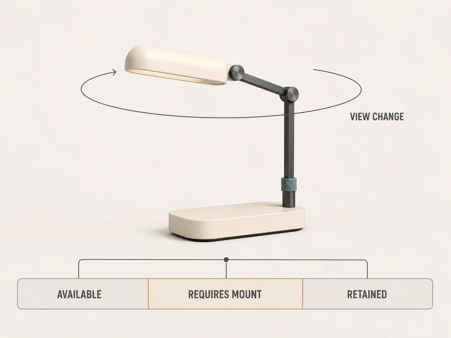
When a choice is unavailable, name the cause and the shortest valid route: "Requires wall mount" or "Not available with 120 V controller." Avoid "Invalid selection." Error prevention is stronger than a late error message, and useful constraints are one of the methods Nielsen Norman Group recommends for preventing slips.[2]
7. Preserve valid work when a rule cascades
Changing an upstream choice may invalidate several downstream values. Keep every selection that remains valid. Reset only what the rules require, then state exactly what changed and why. A quiet reset damages trust because the rendered product and the order data can diverge without the buyer noticing.
Do not move the user to another step, open a modal or replace the entire context merely because a value changed. WCAG 2.2's On Input criterion says changing a component setting must not automatically cause a change of context unless the user was advised beforehand.[3] Update the relevant state in place when possible and provide an explicit route to review the consequences.
8. Keep the camera predictable
Treat camera position as user state. A material change usually does not justify snapping the model back to its opening angle. Preserve orbit and zoom while the corresponding asset or material updates. If a choice affects a hidden region, offer a brief, labeled "View change" action or a restrained guided move, then return control.
Define limits for zoom, orbit, pan and automatic framing per product. Test rapid option changes while the user is moving the camera. The release should reject a stale asset response that replaces a newer selection, and it should avoid camera jumps when geometry bounds change. These are project acceptance rules, not claims that one camera policy fits every product.
Patterns 9-12: expose commercial consequences
9. Provide local undo, reset and comparison
A single global "Start over" control is a poor substitute for undo. Let the buyer reverse the last meaningful choice, reset one group and restore the approved starting state. If comparison matters to the buying task, hold two or three named configurations and make the changed attributes visible. Do not duplicate the full configurator in tiny side-by-side viewports.
Nielsen Norman Group's user-control heuristic recommends undo, redo and a clearly marked exit from an unwanted action.[2] Decide what an undo restores: option values, price, camera, annotations and generated outputs may have different histories. Test the boundary rather than assuming one browser-state snapshot is enough.
10. Keep price or pricing status beside the configuration
Show the current total where it remains visible during choice changes. When useful, separate base price, option delta, one-time charges and recurring charges. State the currency, tax treatment and whether the figure is exact, estimated or requires a quote. Never use zero as a placeholder for an unknown price.
Price changes need a cause. If selecting a finish adds 80, show the delta on that choice and update the total once. If rules return a range, explain which unresolved input controls the range. Keep raw pricing logic on the trusted side of the architecture and record the exact request and response used for acceptance.
11. Attach availability to the selected combination
A product family can be available while one configuration is not. Show stock, build time, shipping eligibility or "check required" against the current set of option IDs. Clear or recompute that status when a dependent choice changes. Never leave an earlier green availability message attached to a new combination.
If the system does not have live inventory or scheduling data, say what it does know. "Configuration can be submitted for confirmation" is honest. "Ships in five days" is not, unless an authoritative integration returned that result and the business accepts the promise. The UX pattern is visible provenance, not a fabricated sense of certainty.
12. Review before commitment
End with a readable configuration summary: product, selected options, excluded or unresolved requirements, price status, availability status and intended output. Each section needs an edit path that returns to the relevant control without clearing other valid work. The 3D image can accompany the summary, but text remains the order and accessibility reference.
Where the next action creates a financial transaction or another covered commitment, WCAG 2.2 requires a reversible submission, an input check with an opportunity to correct, or a mechanism to review, confirm and correct before finalising.[3] A project enquiry is not automatically a checkout, but a review step is still useful when the request carries a detailed configuration into sales or engineering.
Patterns 13-15: support real devices and interrupted sessions
13. Design mobile, keyboard and touch paths together
A narrow screen changes the relationship between model and controls. Keep the active option name, current total or pricing status, and next action visible without covering the product or trapping the page scroll. Provide buttons for any core action that otherwise depends on a precise drag gesture. Test the layout with browser zoom and an on-screen keyboard, not only a resized desktop window.
WCAG 2.2 requires keyboard-operable functionality, a visible keyboard focus indicator and, at Level AA, pointer targets of at least 24 by 24 CSS pixels unless a listed exception applies.[3] That 24-pixel criterion is a conformance floor with exceptions, not a universal product-design target. Set a project target for the actual audience and device mix, then retain measurements for option cards, camera controls, close buttons and sticky actions.
14. Show processing and measure interaction response
A choice should immediately show that it was received. Mark the selected control, identify the preview region as updating and keep the last confirmed product state visible until the new state is ready. If a response arrives out of order, discard it. If loading fails, retain the selection and offer a useful retry rather than rolling back silently.
WCAG 2.2 requires status messages to be programmatically determinable so assistive technology can present them without moving focus.[3] Announce meaningful states such as "Finish selected, preview updating" and "Preview failed, selection retained," not every rendering frame.
Interaction to Next Paint measures responsiveness across click, tap and keyboard interactions. web.dev classifies an INP at or below 200 milliseconds as good when assessed at the 75th percentile of field page loads, separated for mobile and desktop.[6] Use that as a web-performance signal, not a claim that every asset update must finish in 200 milliseconds. Measure selection feedback, control opening, camera actions and summary edits separately from network-bound model completion.
15. Save a versioned configuration, not a screenshot
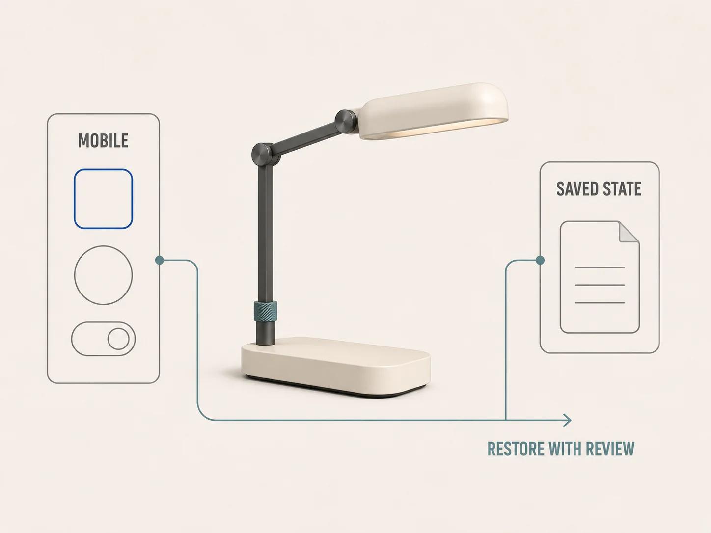
A useful saved state carries stable product and option identifiers, quantities, rule-set version, locale, currency and any output references the receiving system needs. The visible labels can change; identifiers and migration rules preserve meaning. A share link should reopen the same valid state or explain which values no longer exist.
Define expiry and privacy behaviour before adding "Save" or "Share." Do not place confidential customer data, unpublished prices or unrestricted internal identifiers in a public URL. On refresh, show whether the configuration was restored locally, loaded from a server or rebuilt from the link. If recovery fails, keep a readable summary and identify the first decision that needs attention.
Turn the patterns into release evidence
Score each pattern against a named task rather than averaging everything into one usability number. Use four outcomes: pass, pass with an accepted exception, fail, or not applicable with a reason. A critical rule mismatch, inaccessible required control, wrong price, lost configuration or stale visual state should block the affected release path even if the rest of the interface looks polished.
Retain the raw evidence: state-transition logs, rule traces, option and pricing requests, screen-reader output, keyboard scripts, physical-device recordings, interaction timings, saved-state payloads and screenshots tied to revisions. When validation produces errors, put a summary at the start, repeat the same message beside the affected control and link the summary back to that control. The GOV.UK Design System's error-summary pattern follows that structure and also calls for keyboard focus to move to the summary.[5]
Run at least three journeys: the common valid path, an incompatible path with recovery, and an interrupted path that resumes on another viewport or device. Add product-specific journeys for regulated outputs, dealer workflows, bulk quantities or generated documents. Report observed results only. This framework does not supply benchmark conversion rates, completion rates or commercial outcomes.
Separate reusable UX architecture from product discovery
The reusable layer includes selection semantics, state transitions, constraint messages, undo history, price and availability interfaces, save/share schema, event names, accessibility behaviour and the test harness. These can be designed as components and contracts.
Discovery supplies the facts those contracts cannot invent: the option taxonomy, valid combinations, preferred defaults, geometry variants, material references, pricing authority, tax rules, inventory source, generated documents, approval roles and integration ownership. A previous configurator may demonstrate delivery capability, but it does not prove that another product has the same rules, migration path or rescue outcome.
The configurator architecture and phases guide owns the broader build sequence. Use this UX library to write acceptance criteria inside that sequence, then validate them with the representative product and real integrations. If the rules, assets, interfaces and ownership need to become a delivery brief, the custom 3D product configurator service is the direct commercial route.
A strong interactive product configurator does not hide complexity with animation. It gives each choice a clear meaning, each rule a visible consequence and each handoff enough evidence to reproduce the selected result.