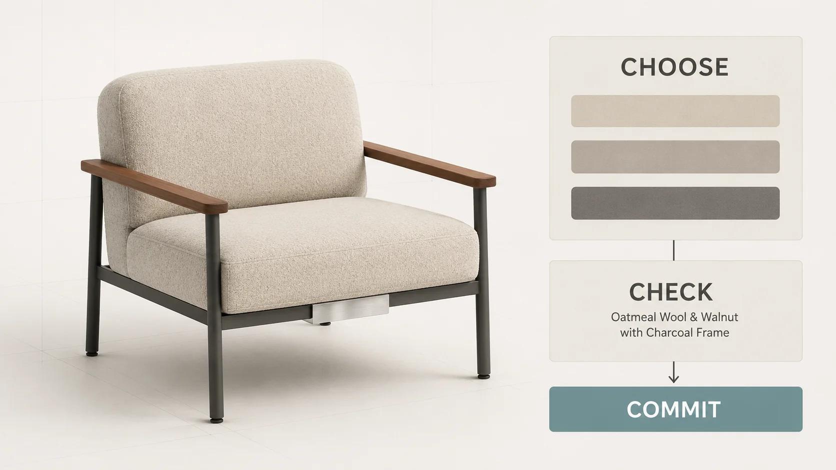
The best 3D product configurator examples make five things easy to understand: what is being configured, which choices are valid, what changed, whether progress can be recovered and what happens after the last choice. A polished model helps, but it cannot carry those responsibilities on its own.
We tested four public experiences on desktop and at a 390 px mobile viewport on 31 August 2026: Roomle's Metro SmartWall demo, Nike By You for the Sabrina 4, the Porsche 911 configurator for Egypt and KitchenAid's built-in refrigerator experience hosted by Emersya.[2][3][4][5] This is a dated UX review, not a platform benchmark. We did not inspect private rules, product data, analytics or order accuracy, and we do not infer customer results from a public interface.
If you need the component-level definition first, read what a 3D product configurator is. Here, the question is narrower: which visible patterns are worth carrying into a real brief?
How we scored the examples
Each experience receives zero to four points on five dimensions. A four means the tested path made the behavior clear without explanation. A three means the behavior was useful with some friction. A two means the capability was present but weak or incomplete in the tested path. One means it was hard to find or use. Zero means we did not observe it; it does not prove the product lacks it elsewhere. These are Double Edged editorial scores derived from the dated observations in this article; none of the vendors supplied or endorsed them. The names and scores in the table below refer to the dated Roomle, Nike, Porsche and KitchenAid routes cited in the test scope above.[2][3][4][5]
| Example | Product clarity | Rules and state | Mobile path | Recovery and access | Commercial handoff | Total |
|---|---|---|---|---|---|---|
| Porsche 911 | 4 | 4 | 3 | 3 | 4 | 18/20 |
| Nike By You, Sabrina 4 | 4 | 3 | 3 | 3 | 4 | 17/20 |
| Roomle Metro SmartWall | 4 | 4 | 3 | 2 | 3 | 16/20 |
| KitchenAid built-in refrigerator | 3 | 2 | 4 | 0 | 1 | 10/20 |
The scorecard rewards evidence in the tested journey. Product clarity covers scale, angle, active part and visible change. Rules and state cover valid choices, dependencies, progress and consequences. Mobile path asks whether the same decision remains understandable on a narrow screen. Recovery and access covers save, share, undo, keyboard use, focus and alternatives to gesture-only control. Commercial handoff covers a visible price, quote, cart, enquiry or another honest next step.
Component score trail
Each component below points to something retained from the tested route. Missing evidence caps a score; it does not prove the feature is absent elsewhere. The observation trail uses the same captured Porsche, Nike, Roomle and KitchenAid routes.[2][3][4][5]
| Example | Dimension | Score | Evidence retained from the tested state |
|---|---|---|---|
| Porsche 911 | Product clarity | 4 | The route kept the 911 Carrera identity, visual context, named option groups and labelled choices together. |
| Porsche 911 | Rules and state | 4 | Categorised stages, option prices, a running total and a detailed summary exposed both current state and cost consequences. |
| Porsche 911 | Mobile path | 3 | The 390 px route showed the same option catalogue and a 1/10 stage indicator without horizontal document overflow, but required a long vertical journey. |
| Porsche 911 | Recovery and access | 3 | Saved vehicles, Porsche Code creation/loading and PDF download offered several ways to carry or recover the result. The short test did not establish complete keyboard operation or alternatives to every gesture. |
| Porsche 911 | Commercial handoff | 4 | The tested route exposed a running total, summary, vehicle enquiry, Porsche Code and downloadable configuration record. |
| Nike By You, Sabrina 4 | Product clarity | 4 | The builder named the shoe, active part and selected colour beside the 3D product view. |
| Nike By You, Sabrina 4 | Rules and state | 3 | Vamp, Purple Venom, 1/10, previous, next and menu made the current step legible; the test did not establish dependency handling across all ten steps. |
| Nike By You, Sabrina 4 | Mobile path | 3 | The 390 px product route retained Customize, size, purchase and share controls without horizontal document overflow, but a location prompt delayed entry and the mobile builder was not fully exercised. |
| Nike By You, Sabrina 4 | Recovery and access | 3 | The desktop builder exposed share, previous, next and menu controls. We did not verify saved-state semantics or complete keyboard operation. |
| Nike By You, Sabrina 4 | Commercial handoff | 4 | Product name, price, size selection, Customize and Sign In to Buy remained on the same route. |
| Roomle Metro SmartWall | Product clarity | 4 | The 3D product stayed beside named finish, mounting, section-count and upright-height choices. |
| Roomle Metro SmartWall | Rules and state | 4 | One-, two- and three-section structures, two upright heights and Continue to Section 1 made the system boundary and sequence visible. |
| Roomle Metro SmartWall | Mobile path | 3 | The same categories and continuation step fit the 390 px viewport without horizontal document overflow, although the option hierarchy was condensed. |
| Roomle Metro SmartWall | Recovery and access | 2 | Save draft was visible on desktop but not in the captured mobile start state, and the test did not establish its persistence or complete keyboard operation. |
| Roomle Metro SmartWall | Commercial handoff | 3 | Add to cart was visible on desktop, but the mobile start state did not expose it and checkout was outside the test. |
| KitchenAid built-in refrigerator | Product clarity | 3 | The start state clearly separated three refrigerator families and their available widths, but it did not yet show a rendered product state. |
| KitchenAid built-in refrigerator | Rules and state | 2 | Family and width acted as an orientation gate. Deeper option dependencies and consequences were not exercised. |
| KitchenAid built-in refrigerator | Mobile path | 4 | All three family-and-width choices remained legible at 390 px with no horizontal document overflow observed. |
| KitchenAid built-in refrigerator | Recovery and access | 0 | The captured start state exposed no save, share, undo, reset or other recovery control, and we did not observe a keyboard path. |
| KitchenAid built-in refrigerator | Commercial handoff | 1 | Design was the only visible continuation. We observed no price, cart, quote, enquiry or summary in that state. |
Accessibility is not a bonus point. WCAG 2.2 requires content functionality to be operable through a keyboard unless the input depends on the path of movement. It also requires a single-pointer alternative for authored dragging interactions unless dragging is essential, and sets a 24 by 24 CSS pixel minimum target with defined exceptions.[6] We used those requirements as review prompts, not as a claim that a short public test establishes conformance.
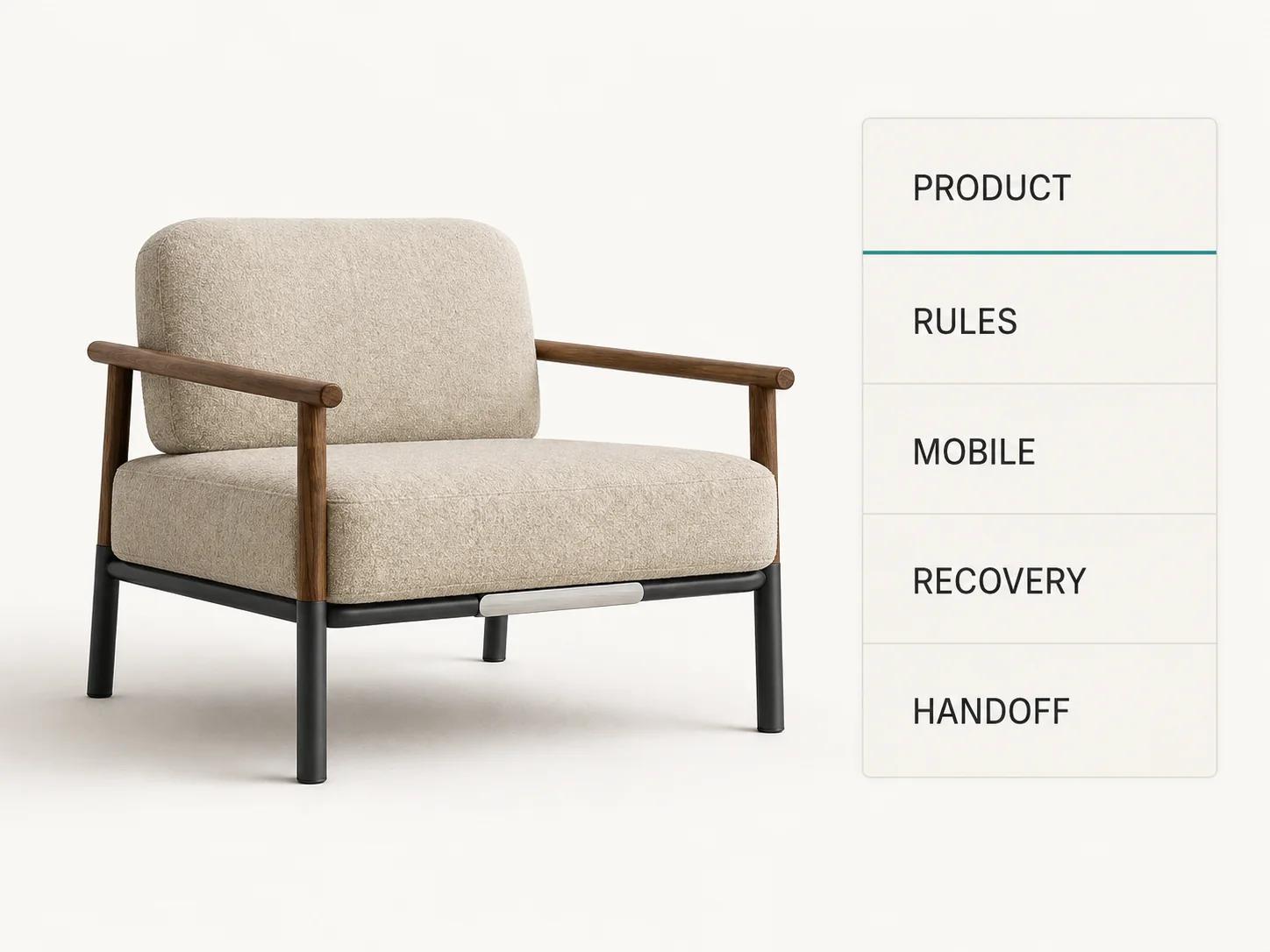
What four public examples do right
Roomle makes product rules visible before the user gets lost
Roomle describes its full-logic demos as parameter-based and modular: dimensions, materials, colours and features can be changed, while modules can be combined into a larger configuration.[1] The Metro SmartWall demo makes that distinction tangible. Its first step exposes finish, mounting style, the number of grid or shelf sections and upright height. The user can choose one, two or three sections and 30 or 45 inch uprights before continuing to Section 1. The rendered product stays beside the controls, and the desktop view offers Save draft and Add to cart.[2]
That is a strong pattern for modular furniture, storage and equipment. The opening step defines the system boundary before asking about accessories. Labels describe product concepts rather than internal SKU codes. The choice set also signals that logic exists: one section and three sections are different structures, not merely different camera views.
The weakness is recovery. In our public test, Save draft appeared on desktop but not in the visible mobile starting state. We also did not see an explanation of what a saved draft contains or how long it persists. A production brief should specify draft identity, expiry, account requirements and what happens when catalog rules change after saving.
Nike keeps a long sequence anchored to one product part
The Sabrina 4 By You page keeps the commercial product page intact before the builder opens. It presents the product name, price, size selection, Customize entry point, purchase control and sharing on the same route.[3] After we opened the builder on desktop, the interface showed the shoe in a 3D canvas, named the active part as Vamp, displayed progress as 1/10, named the selected colour Purple Venom and offered previous, next, menu, share and Done controls.[3]
The useful idea is the narrow decision window. A buyer does not face ten categories and every colour at once. The active component has a name, the sequence has a count and the product remains the visual anchor. That combination reduces the memory burden: the user can see where a choice applies and how much work remains.
Entry friction still matters. During the mobile test, a location prompt appeared before the builder, and we did not complete builder entry in that state. In the desktop test, a What's New dialog covered the product after the builder opened. Both were understandable interruptions, but they added a step before or at the first product decision. A team copying this approach should reserve onboarding for behavior the controls cannot explain and remember dismissal across the session.
Porsche carries configuration state into a decision record
The Porsche 911 path shows why configurators for expensive, option-heavy products need more than attractive visuals. In the Egypt route we inspected, the interface presented priced colour and equipment choices, a running total, ten configuration stages on mobile, a detailed summary, Create Porsche Code, PDF download and a vehicle-enquiry route. It also displayed regional caveats about price, availability, colour reproduction and equipment.[4]
Three details are worth borrowing. First, option labels and prices sit together, so the cost consequence is visible at the point of choice. Second, the summary preserves selected equipment by category instead of reducing the outcome to one image. Third, the Porsche Code creates a bridge between self-service exploration and a later conversation. The configured state becomes a reference, not a screenshot the buyer has to explain.
The trade-off is density. The tested mobile page exposed many colour, wheel, interior, exterior and technology choices in a long vertical catalogue.[4] The 1/10 indicator helped, but the buyer still needed a reliable way to return to an earlier category and understand dependencies. For a smaller catalog, copying this much hierarchy would add work without adding confidence.
KitchenAid narrows the product family before showing details
KitchenAid's Emersya-hosted experience opens with three recognisable refrigerator architectures: French door bottom mount, side by side and bottom mount. It then exposes the available widths for each family and gives each one a Design action.[5] The same starting choices remained legible in our 390 px view, with no horizontal overflow observed.
This is the lightest example in the set, and that is useful. The start screen does not ask for finish, handles or panels before the buyer has chosen the appliance architecture and opening width. Product-family selection is a gate, not a filter hidden above a dense option grid.
It scored lower because the starting state did not expose price, save, share, summary or a purchase or enquiry handoff. We also could not test deeper logic from the captured state. The lesson is not that every configurator needs a Porsche-sized summary. It is that a simple first step still needs a defined destination and recovery behavior in the full journey.
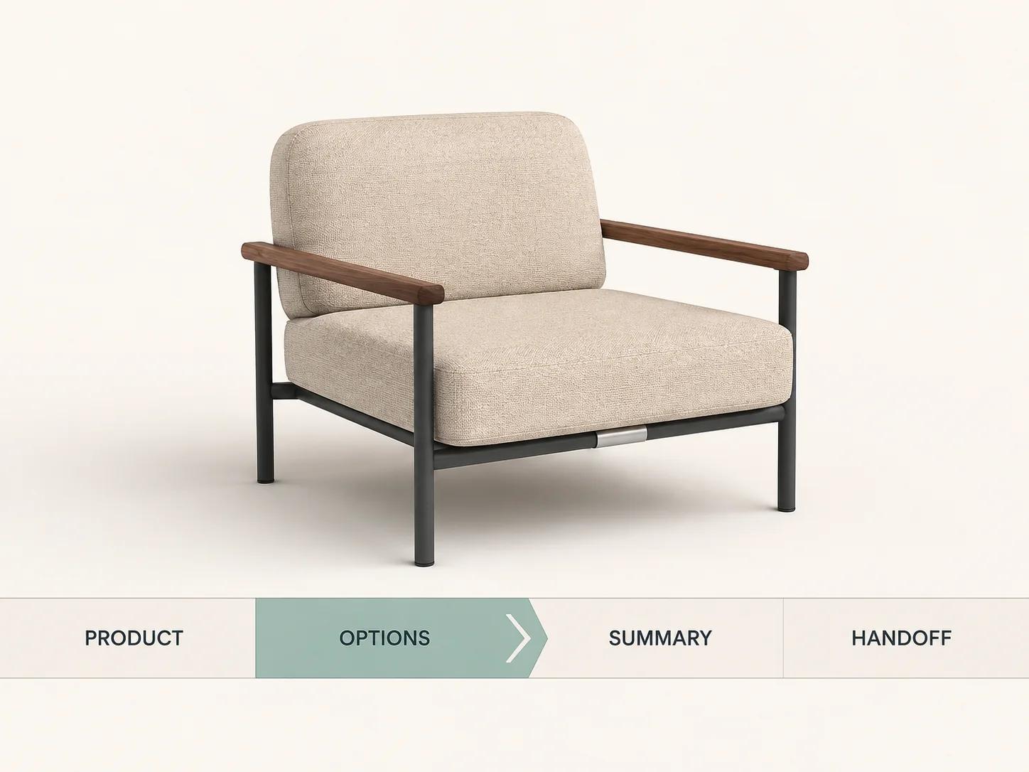
Copy the decision pattern, not the interface
A good example is useful when you can name the uncertainty it removes. Roomle reduces uncertainty about whether a modular structure is valid. Nike reduces uncertainty about where a finish applies and how many choices remain. Porsche reduces uncertainty about the selected equipment, total and handoff. KitchenAid reduces uncertainty about which product family to enter. Those are reusable decision patterns. Their exact layouts are not.
Start a teardown with the buyer's hard question. Then write down the interface evidence that answers it, the product data required to keep that answer true and the failure state that would make the answer misleading. This prevents a review from becoming a collection of attractive screenshots.
| Teardown note | Useful question | What the build must own | Release evidence |
|---|---|---|---|
| Active product part | Can the buyer tell exactly where this choice applies? | Stable component names and a mapping from option value to visual state | Scripted choice with before and after views plus the selected value |
| Valid option set | Can the buyer distinguish unavailable, incompatible and merely unselected choices? | Dependency rules, reason codes and copy for blocked states | Expected result for valid and invalid configurations |
| Recoverable progress | Can a buyer leave, share or sign in without losing work? | Configuration ID, catalog version, expiry and migration policy | Reopened state compared field by field with the saved state |
| Commercial result | Can the next system identify the same configuration? | Price or quote source, SKU or bill of materials mapping and handoff contract | Matching configuration ID in summary, cart, enquiry or quote record |
The pattern also needs to fit the product. A part-by-part sequence works when each decision has a clear target and a useful order. It becomes frustrating when most choices are independent and the user has to click through empty steps. A large category hierarchy helps when the catalog genuinely needs it. For a product with four finish choices, that hierarchy would create ceremony rather than clarity.
Write the reason for every step into the brief. “Choose mounting style before accessories because it changes the valid attachment set” is testable. “Follow the competitor's flow” is not. If the reason cannot be tied to a rule, a customer decision or a downstream record, remove the step or prove why it belongs.
Keep configuration state outside the 3D canvas
A model can show the current result, but it cannot reliably explain why another option disappeared, whether a price changed or which rule fired. Put those facts in accessible interface text and structured state. The product view should answer “what does it look like?” The surrounding controls should answer “what did I choose, what remains possible and what happens next?”
A useful state model records the product family, selected option values, dependencies resolved, unavailable choices, price or quote status, camera state, step, validation messages and a stable configuration identifier. It should also define which fields survive a refresh, share link, account sign-in or return visit. The real-time 3D configurator guide covers rendering, rules and performance as separate system concerns; bundling them into one visual component makes each harder to test.
Do not rely on orbit, pinch or drag as the only way to inspect the product. Provide named views, zoom buttons and reset. Keep every option reachable by keyboard, make focus visible and announce price or validity changes without forcing a screen-reader user to hunt for them. WCAG's keyboard and dragging criteria are a practical floor for the interaction contract.[6]
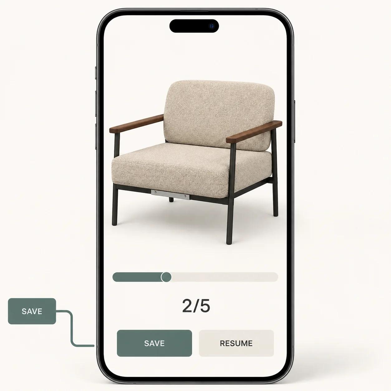
Mobile needs a different decision rhythm
All four tested pages fit within a 390 px viewport without observed horizontal document overflow, but their decision rhythms differed.[2][3][4][5] Roomle kept a full-height product canvas and condensed the option hierarchy. Porsche stacked its extensive catalog below the product context. KitchenAid turned its three starting families into a single vertical sequence. Nike retained the product-page purchase path but added a region prompt before the builder; a What's New dialog appeared after the builder opened in the desktop test.
A mobile configurator should keep one current decision, the product result and a next or summary action within a short scroll relationship. If the option tray covers the model, let the user collapse it without losing the active part. If the model consumes the viewport, keep the active choice and progress visible. Preserve the same configuration ID when the user rotates the device or moves from phone to desktop.
Touch targets also need room. WCAG 2.2's 24 by 24 CSS pixel minimum includes exceptions, but using the exception as the default is a poor product brief.[6] Colour swatches need programmatic names, selected state and a visible focus treatment. A row of tiny circles that only differ by colour can look clean and still fail to communicate.
A working demo is not a production acceptance test
The public examples reveal interface patterns. They do not reveal catalog governance, rule coverage, asset lineage, integration reliability or operational cost. Before treating a demo as architecture proof, ask for evidence at six boundaries:
- Product data: who owns option names, values, availability and lifecycle changes?
- Rules: how are dependencies, invalid combinations and exceptions tested?
- Visual assets: which state maps to each mesh, material, decal and camera view?
- Commerce: where do price, quote, cart, SKU or bill-of-materials records come from?
- Delivery: what are the mobile, loading, failure, accessibility and fallback budgets?
- Operations: who can publish a catalog change, roll it back and diagnose a broken configuration?
Run representative products through those boundaries. A simple finish swap, a dependency-heavy configuration and the largest valid configuration often expose different failures. Add one invalid combination and one out-of-stock state. Record the exact configuration ID and expected output at every gate.
The choice between a 2D rules interface and interactive 3D belongs in the discovery phase. Use the 2D versus 3D product configurator comparison to make that decision. This examples guide does not assume 3D is necessary for every catalog.
Turn the examples into a scoped build decision
The interface pattern should follow product complexity, not brand prestige. Use this matrix to select a starting architecture.
| Product problem | Useful starting pattern | What must be proven before build |
|---|---|---|
| Finish or colour changes on a fixed product | Product page with named swatches and a viewer | Accurate material mapping, mobile fallback and purchase-state continuity |
| Several independent component choices | Guided sequence like Nike's part-by-part path | Clear progress, component naming, recovery and a complete summary |
| Modular dimensions and dependent parts | Rules-led flow like Roomle's system-first path | Constraint coverage, valid outputs, pricing or quote rules and draft versioning |
| Large priced option catalog | Category hierarchy, running total and decision record like Porsche | Dependency explanation, stable configuration ID, regional data and sales handoff |
| Family selection before detailed design | Orientation gate like KitchenAid's starting screen | Correct family boundaries, width or fit rules and a defined next commercial step |
Cost and effort usually concentrate in the data and rules behind the screens: number of option families, dependency depth, visual-state count, pricing ownership, product-data quality, required integrations, save or share behavior, accessibility and operating workflow. A count of colour swatches is not enough. Two products with ten options can have very different complexity if one permits every combination and the other has nested exclusions tied to region, inventory and manufacturing.
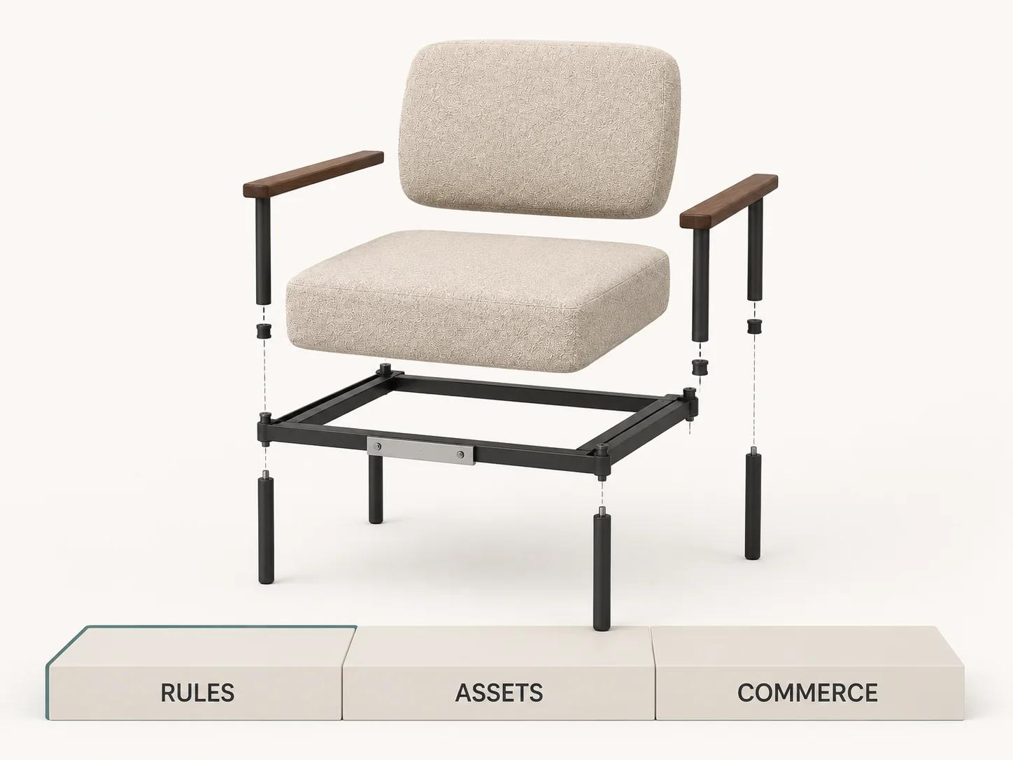
The estimator maps catalog scale, rules, visualization, asset readiness, integrations, pricing, outputs and operating ownership into a complexity profile and recommended next step. It explains scope pressure instead of turning unknown requirements into a fictional budget.[7] If the rules and commercial case already justify custom work, review the custom 3D product configurator service and bring a representative product, example dependencies and the systems that must receive the final configuration.
Use a repeatable release test
A useful teardown ends in a test script, not a mood board. Run this five-part check on the exact release candidate:
- Start three configurations: the default, the most common valid order and the largest or most dependent valid order.
- Attempt two invalid paths and confirm the interface prevents or explains them without silently resetting previous work.
- Save or share midway, reopen in a clean session and compare every selected value, price or quote input and visual state.
- Repeat the core path at 390 px and with keyboard-only input. Test named views and buttons as alternatives to drag and pinch.
- Finish the journey. Confirm the summary, SKU or bill of materials, price or quote, analytics event and cart, enquiry or sales handoff all carry the same configuration identifier.
Capture screenshots where they help, but keep structured evidence too: test case, configuration ID, catalog version, device, browser, expected state, actual state, failure owner and disposition. Rerun the affected cases when product data, rules, assets, integrations or viewer code changes.
The public examples above are useful because each solves a visible part of the journey. Roomle exposes system rules, Nike controls pacing, Porsche preserves commercial state and KitchenAid starts with orientation. A production configurator has to connect those ideas to the product data and operating model that make the final configuration trustworthy.